Table of Contents
Introduction
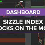
The Market Pulse Dashboard is a powerful ThinkOrSwim tool that visually ranks stocks by trend strength using color-coded stages. It combines the Bullish Squeeze Signal Scan with Variable Moving Average (VMA) relationships to identify acceleration, accumulation, and distribution phases. Traders can instantly sort watchlists to find stocks like Western Union (WU) with 46 consecutive bullish bars or new trends like AR and EOG.
This dashboard solves the time-consuming process of manually analyzing multiple charts by automating trend classification across timeframes. The 30-minute and daily columns help traders spot emerging opportunities (green acceleration) or potential pullbacks (gray accumulation). Custom counters track consecutive bullish/bearish bars, providing objective metrics for trade decisions.
In today’s video, we’re going to be building a Market Pulse Dashboard, very similar to the one that you see right here on my charts. Let me start by showing you why this is useful in the first place.
So if I expand the watchlist column, you’ll notice the scan that I’m using to populate this watch list of stocks is our Bullish Squeeze Signal scan. We have a bullish bias on all of these stocks.

Now, I have two other columns loaded into this watchlist.
- Market Pulse stage off of a 30-minute time frame
- Market Pulse off of a daily time frame
The next step (typically) is to quickly review these stocks from the daily chart. This will help us determine which investments worked best historically, and where we should place our bets on a long-term basis.
Instead, what this allows you to do is just by clicking the header of the column, you can sort through a large list of stocks, and determine which have the strongest bullish trend, denoted by the green “Acceleration” label.
You’ll notice if we scan up and down the watchlist, Western Union has the highest number, representing the longest active bullish trend, with 46 bars consecutively.
So, using this process, Western Union would be the stock in which you see this trend is the most bullish. If we tried to find newer trends, you’ll see at the top of the list, you have more symbols, in which the Market Pulse just turned green one bar ago.
And that’s what we currently see on our charts.
Suffice to say, a trend of sorts is forming. Pullback opportunities are more likely to occur in the accumulation stage, or at the beginning stages of a new market trend.
You can also build your own filters, or modify existing ones in the Dashboard, to tweak the code to work for your particular trading style.
In this tutorial, you’ll learn how to build a Market Pulse Dashboard, along with how to customize an existing indicator and convert it into a dashboard.
In case you would like to jump straight into the final version of this code, you can download it by clicking the green “Download” button on the right-hand side.
If you’d prefer to follow along with the coding section of this tutorial, you’ll need to install the Market Pulse indicator, which is available for free download.
Market Pulse: Summarize Indicator Code
Let’s do a quick review as I think that’ll be helpful to understand how the code is laid out.
At the top of the code, we have our input variables.

Here we have three different inputs, with price and length being the “static” values.
The next chunk of the code (lines 12 to 22) defines the 10-period variable moving average, which represents the Market Pulse line. This is code directly from ThinkOrSwim, through their built-in indicator.
If we keep coming down the code, we then have (4) different variable weighted moving averages:
- 8-VWMA
- 21-VWMA
- 34-VWMA
We look at the relationship between each moving average to create three variables. One is bullish, which is acceleration stage; one is bearish, which is deceleration stage; and then finally we have distribution period if you’re not either bullish or bearish.
Market Pulse Dashboard: thinkScript Coding Section
Now that we understand our existing code, we can start tweaking any necessary pieces to build the Market Pulse Dashboard code.
Let’s start by giving our Dashboard the name – “TI_MarketPulseDashboard”
There are a handful of adjustments that we need to make to the indicator code, in order for us to successfully build a thinkScript dashboard:
- Transition all “input” variables into “def” variables, with pre-determined values
- Transition all “plot” variables into “def” variables, deleting any formatting code
- Tweaking the code outputs for a dashboard vs. an indicator
- Adding additional logic for AddLabel variables (including a counter)
The video tutorial walks through each of the above 4 changes in great detail, taking you through a step-by-step process of turning the Market Pulse indicator code, into a dashboard custom quote script.
In case you face any errors along the way, you can compare your version of the dashboard code to ours, by downloading the final Market Pulse Dashboard code via the green “Download” button.
Conclusion
I hope this tutorial was helpful for those of you who like using the Market Pulse as an alternative to the Moving Averages in order to gauge what direction a trend is going.
This should be a useful tool to do that in a quicker faster in probably a much more codified manner than what we currently had available to us. It should also make analyzing any trades from scans or results that we have from other places a lot easier in terms of understanding trend, especially if you want it to have this broken down across a multitude of timeframes.
Alright, take care everyone.
Good luck trading. I hope this thing thinkScript tutorial was useful for those of you who were curious how to turn an indicator into a dashboard!
Market Pulse Dashboard.ts
# Market Pulse Dashboard for ThinkOrSwim

# Generated by TOS Indicators

# Full tutorial: tosindicators.com/indicators/market-pulse-dashboard

# User Inputs

input length = 14;


// ... 23 more lines ...Adding Market Pulse Dashboard to your ThinkOrSwim platform is a straightforward process that takes just a few minutes. First, open your ThinkOrSwim desktop application and navigate to any chart. Click the "Studies" button in the top toolbar, then select "Edit Studies" from the dropdown menu. In the Studies window that appears, you'll see a search box in the upper left corner. Type "Market Pulse Dashboard" to quickly locate the indicator. Once found, double-click it or select it and click "Add Selected" to apply it to your chart. The indicator will appear with default settings, which work well for most traders. However, you can customize these by clicking the gear icon next to the indicator name in the studies list. This opens the settings panel where you can adjust periods, colors, and other parameters. For best results, start with a liquid stock like SPY or QQQ on a 15-minute chart to see how the indicator behaves. Many professional traders recommend saving your configured chart as a template using the "Setup" menu, so you can quickly apply the same indicator settings to other symbols. Remember to test the indicator during different market conditions - trending, ranging, and volatile periods - to understand its strengths and limitations before using it for live trading decisions.
The optimal settings for Market Pulse Dashboard depend significantly on your trading style, timeframe, and the specific instruments you trade. For day trading, most professionals recommend using shorter timeframes like 5-minute or 15-minute charts with more sensitive settings to capture intraday movements. Start with the default parameters and adjust based on your backtesting results. For example, on SPY or QQQ, you might use a period of 9-14 for quick signals, while more volatile stocks like TSLA might require periods of 20-30 to filter out noise. Swing traders typically prefer daily charts with standard settings, often using periods between 20-50 for more reliable signals. The key is to find settings that generate signals aligning with your risk tolerance and trading plan. Test different configurations using ThinkOrSwim's OnDemand feature, which allows you to replay historical market data. Document your results with different settings across various market conditions - bullish trends, bearish trends, and sideways markets. Many successful traders use a two-chart approach: one with aggressive settings for early signals and another with conservative settings for confirmation. Remember that no single setting works perfectly in all market conditions, so consider having preset configurations for trending versus ranging markets that you can switch between based on current conditions.
Market Pulse Dashboard compatibility with ThinkOrSwim mobile varies depending on the indicator's complexity and whether it's a built-in or custom study. To check availability, open your ThinkOrSwim mobile app and navigate to the Charts section by tapping the chart icon at the bottom. Select any symbol, then tap the indicators button (usually shown as "fx" or a graph icon). Search for "Market Pulse Dashboard" in the studies list. If it appears, you can add it just like on desktop. However, mobile versions often have limitations - complex calculations may be simplified, some visual elements might not display, and customization options are typically reduced. For full functionality, most traders use a hybrid approach: perform detailed analysis on desktop where you have access to all features and customization options, then monitor positions and key levels on mobile. Set up push notifications for important price levels or indicator signals to stay informed while away from your desktop. If Market Pulse Dashboard isn't available on mobile, consider setting up alerts on the desktop version that will push to your phone. Many traders also use ThinkOrSwim's cloud sync feature to ensure their watchlists and basic chart settings transfer between devices. For critical trading decisions, always verify signals on the desktop platform where you have access to complete functionality and can view multiple timeframes simultaneously.
Setting up alerts with Market Pulse Dashboard in ThinkOrSwim enables you to monitor multiple opportunities without watching screens constantly. To create an alert, right-click on your chart where Market Pulse Dashboard is displayed and select "Create Alert" from the context menu. In the alert dialog, you can set conditions based on the indicator's values, crossovers, or when it reaches specific levels. For example, you might set an alert when Market Pulse Dashboard crosses above a certain threshold or when it generates a buy/sell signal. Choose your notification method - ThinkOrSwim can send alerts via pop-up, email, or mobile push notification. For mobile alerts, ensure you're logged into the ThinkOrSwim mobile app with notifications enabled. Many traders create multiple alert types: aggressive alerts for early signals and conservative alerts for confirmed setups. You can also create complex alerts using thinkScript that combine Market Pulse Dashboard with other conditions like price levels or volume thresholds. Set alert expiration appropriately - use "GTC" (Good Till Canceled) for ongoing monitoring or specific dates for time-sensitive setups. To manage alerts efficiently, use descriptive names indicating the symbol, timeframe, and condition (e.g., "SPY_15min_Market Pulse Dashboard_Bullish"). Test your alerts during market hours to ensure they trigger correctly. Pro tip: Create a separate alert set for pre-market and after-hours if you trade extended sessions, as indicator behavior may differ with lower volume.
Market Pulse Dashboard can be highly effective for swing trading when configured appropriately for longer holding periods. Swing traders typically use daily and weekly charts, focusing on capturing moves lasting several days to weeks. For Market Pulse Dashboard, adjust the settings to be less sensitive than day trading configurations - this means using longer periods (typically 20-50) to filter out intraday noise and focus on meaningful trend changes. When analyzing stocks like AAPL or MSFT for swing trades, combine Market Pulse Dashboard with volume analysis to confirm signal strength. Look for convergence between Market Pulse Dashboard signals and key support/resistance levels identified on weekly charts. Many successful swing traders use a top-down approach: identify the trend on weekly charts, then use daily charts with Market Pulse Dashboard to time entries. Set your stops based on the Average True Range (ATR) to accommodate normal price fluctuations without getting stopped out prematurely. For position sizing, consider the indicator's historical accuracy - if backtesting shows 60% win rate, size positions accordingly. The key advantage of using Market Pulse Dashboard for swing trading is the ability to stay in winning trades longer by following the indicator's trend signals rather than reacting to every minor pullback. Pro tip: Create a watchlist of stocks showing Market Pulse Dashboard signals on weekly charts, then monitor daily charts for optimal entry points when short-term pullbacks occur within the larger trend.
Selecting the optimal timeframe for Market Pulse Dashboard depends on your trading objectives and market approach. Day traders typically find 5-minute and 15-minute charts most effective, as these provide enough data points for the indicator to generate reliable signals while still capturing intraday movements. For stocks like SPY or QQQ, the 5-minute chart works well during high-volume periods (first and last hour of trading), while 15-minute charts help filter noise during midday. Swing traders generally prefer daily charts as their primary timeframe, using 4-hour charts for precise entry timing and weekly charts for overall trend context. The key is ensuring your timeframe aligns with your intended holding period - use a chart where 50-100 bars represent your typical trade duration. Scalpers might even use 1-minute charts with Market Pulse Dashboard, though this requires careful filtering to avoid overtrading. Many profitable traders use multiple timeframe analysis: confirm the trend on a higher timeframe, then use lower timeframes with Market Pulse Dashboard for entry signals. For example, if the daily chart shows bullish signals, look for pullback entries on hourly charts. Volume also influences timeframe selection - thinly traded stocks often require longer timeframes (hourly or daily) for reliable signals, while high-volume stocks like AAPL or TSLA can produce valid signals on shorter timeframes. Test different timeframes during various market sessions to find your optimal configuration.
Backtesting Market Pulse Dashboard strategies in ThinkOrSwim requires a systematic approach to generate reliable results. Start by using the Strategy function rather than just the Study - this allows ThinkOrSwim to track hypothetical trades and calculate performance metrics. Navigate to Studies > Edit Studies > Strategies, then search for or create a strategy based on Market Pulse Dashboard. If creating custom logic, use the thinkScript editor to define entry and exit conditions based on the indicator's signals. For accurate results, test across different market conditions using at least 2-3 years of historical data. Include realistic parameters like commission costs ($0.65 per contract for options, for example) and slippage (0.05-0.10 for liquid stocks like SPY). Use the OnDemand feature to forward-test your strategy in replay mode, which helps identify issues not apparent in standard backtesting. Document results across different timeframes and market conditions - what works in trending markets may fail in choppy conditions. Pay attention to key metrics: win rate, average win/loss, maximum drawdown, and profit factor. A good strategy typically shows profit factor above 1.5 and maximum drawdown under 20%. Test on multiple symbols to ensure the strategy isn't curve-fitted to one particular stock. Many traders find it helpful to backtest the inverse signals as well - if buy signals underperform, perhaps the indicator better identifies shorting opportunities.
Market Pulse Dashboard is well-suited for beginners when approached with proper education and practice. Start by understanding the basic concept behind the indicator - what it measures and why those measurements matter for trading decisions. Before using real money, spend at least 2-4 weeks practicing with ThinkOrSwim's paper trading feature. Add Market Pulse Dashboard to charts of major indices like SPY or QQQ, as these tend to have cleaner price action that's easier for beginners to interpret. Focus initially on the most obvious signals rather than trying to catch every move. Use default settings at first - they're designed to work reasonably well across different market conditions. As you gain experience, you can fine-tune parameters. Combine Market Pulse Dashboard with basic price action concepts like support and resistance to increase accuracy. Set up a trading journal to track when the indicator works well and when it doesn't - this helps identify optimal market conditions for using it. Many beginners make the mistake of relying solely on one indicator; instead, use Market Pulse Dashboard as part of a broader analysis including volume, trend, and market structure. Start with small position sizes, risking no more than 1% of your account per trade while learning. Consider joining ThinkOrSwim's education resources or finding a mentor who uses similar indicators to accelerate your learning curve.
Here are some resources that you may find useful: