
ThinkOrSwim Dashboards
Monitor multiple symbols, timeframes, and market conditions at a glance. Download free dashboards or learn to build your own custom views.
Popular ThinkOrSwim Dashboards
These are our most-used dashboards for monitoring markets in ThinkOrSwim.
Dividend Discount Model
Learn to analyze Medical Properties Trust (MPW) using Fibonacci levels and options strategies on ThinkOrSwim. Discover how to capitalize on its 15% dividend yield with technical insights.
Download Free →
Hourly Sizzle Index
Track hourly price momentum shifts using real-time ATR comparisons. Identify trending stocks and volatility breaches for intraday edge.
Learn More →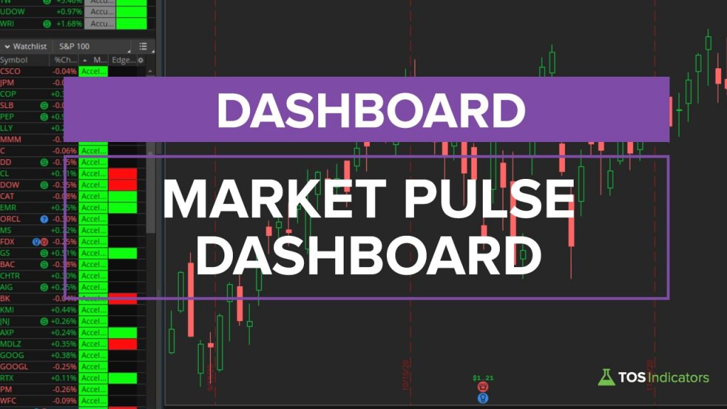 Free
Free
Market Pulse Dashboard
Track real-time market trends with a customizable dashboard. Sort stocks by momentum stages and identify high-probability entries using ThinkOrSwim's Market Pulse.
Download Free →
Relative Performance Dashboard
Transform ThinkOrSwim into a stock analysis database with this SPY-relative dashboard. Quickly identify outperformers like AAPL (+16.65%) and underperformers using real-time metrics.
Download Free →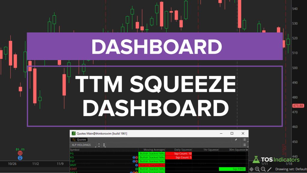 Free
Free
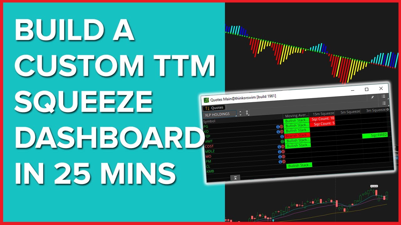
TTM Squeeze Dashboard
Master the TTM Squeeze Dashboard to spot high-probability trades, and transform your trading with proven strategies.
Download Free →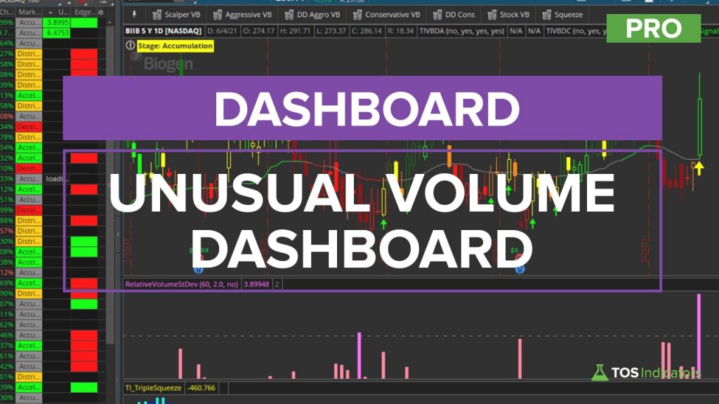 Pro
Pro
Unusual Volume Dashboard
Identify statistically significant volume spikes across watchlists with one click. Combines standard deviation analysis with visual alerts for actionable trading signals.
Learn More →All ThinkOrSwim Dashboards
Browse our complete library of ThinkOrSwim dashboards with code and tutorials.
Dashboards 6 dashboards
Dividend Discount Model
Learn to analyze Medical Properties Trust (MPW) using Fibonacci levels and options strategies on ThinkOrSwim. Discover how to capitalize on its 15% dividend yield with technical insights.
Hourly Sizzle Index Pro
Track hourly price momentum shifts using real-time ATR comparisons. Identify trending stocks and volatility breaches for intraday edge.
Market Pulse Dashboard
Track real-time market trends with a customizable dashboard. Sort stocks by momentum stages and identify high-probability entries using ThinkOrSwim's Market Pulse.
Relative Performance Dashboard
Transform ThinkOrSwim into a stock analysis database with this SPY-relative dashboard. Quickly identify outperformers like AAPL (+16.65%) and underperformers using real-time metrics.
TTM Squeeze Dashboard
Master the TTM Squeeze Dashboard to spot high-probability trades, and transform your trading with proven strategies.
Unusual Volume Dashboard Pro
Identify statistically significant volume spikes across watchlists with one click. Combines standard deviation analysis with visual alerts for actionable trading signals.
Squeeze Course Dashboards 4 dashboards
Triple Squeeze Dashboard Course
Multi-symbol dashboard showing Triple Pro Squeeze status across your watchlist.
Multi-Market Squeeze Analyzer Course
Analyze squeeze conditions across multiple markets and sectors simultaneously.
Multi-Market Trend Analyzer Course
Dashboard for tracking trend direction across multiple symbols and timeframes.
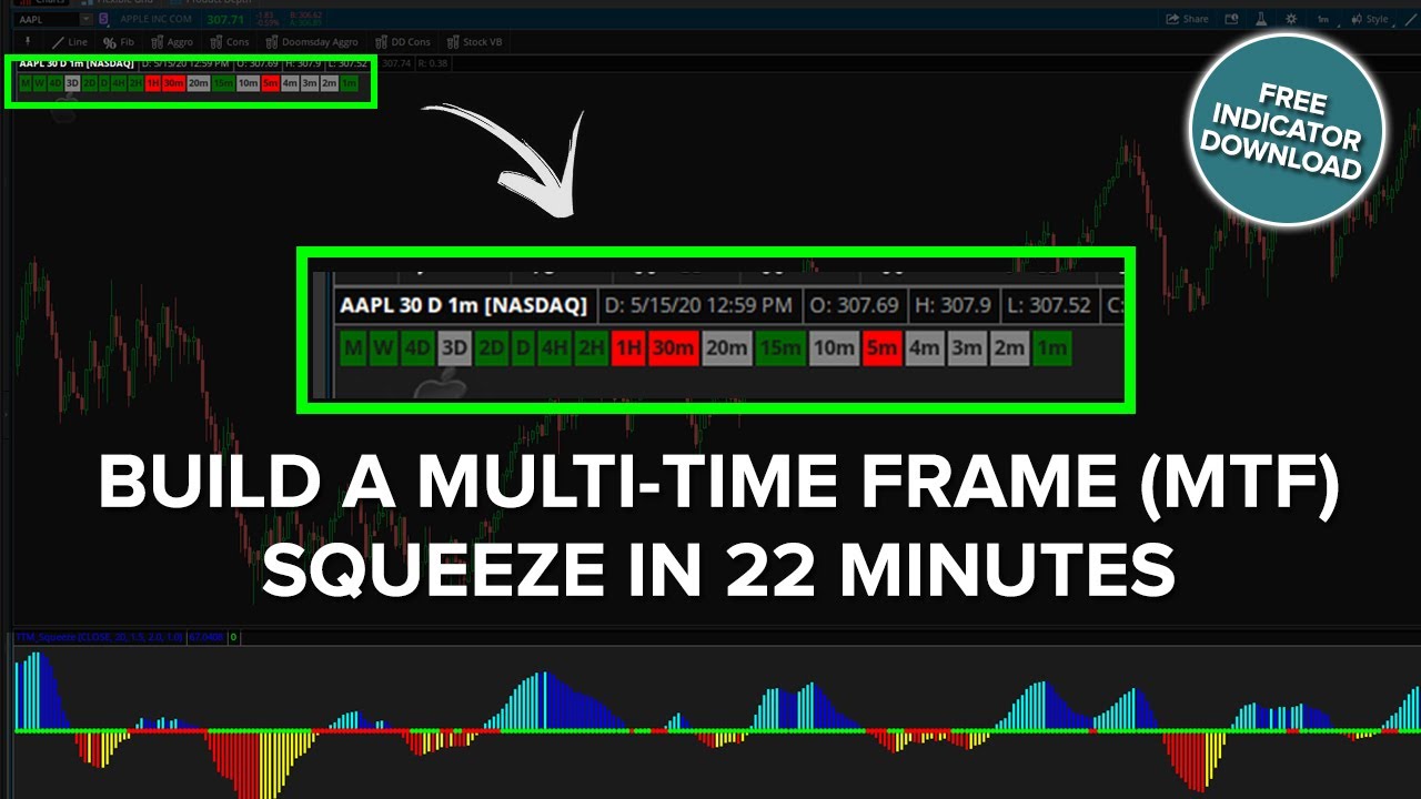
MTF Squeeze Dashboard Course
Multi-timeframe squeeze visualization showing squeeze status on multiple timeframes.
How to Build ThinkOrSwim Dashboards
Learn how to build your own dashboards from scratch using thinkScript with these step-by-step tutorials.

ThinkOrSwim Dashboard FAQ
A ThinkOrSwim dashboard is a custom visualization that displays multiple data points at once, such as squeeze status, trend direction, or market conditions across multiple symbols or timeframes. Dashboards help you quickly assess market conditions without switching between charts.
You can create dashboards using thinkScript labels, custom columns in watchlists, or dedicated lower studies. For multi-symbol views, use watchlist columns. For multi-timeframe views on a single chart, use labels or lower study grids. Our tutorials walk you through building each type.
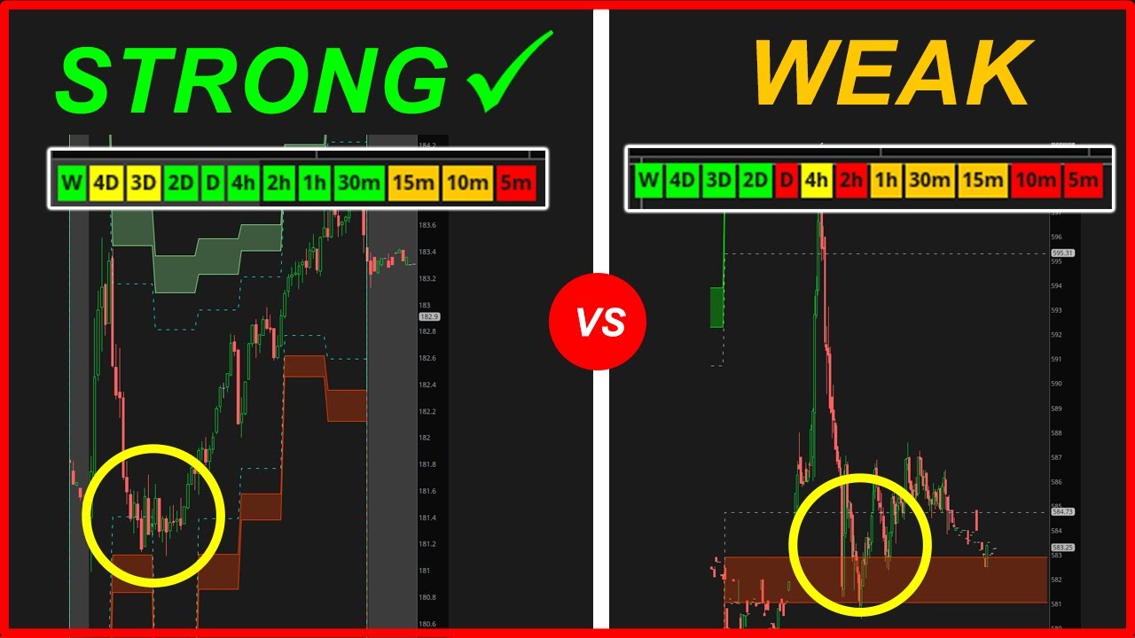
A multi-timeframe dashboard shows the same indicator or condition across multiple timeframes simultaneously. For example, an MTF Squeeze Dashboard shows whether the TTM Squeeze is on or off on the 5-minute, 15-minute, hourly, and daily charts all at once, helping you identify high-probability setups.
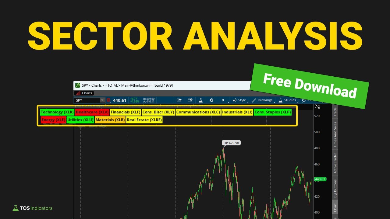
Yes, you can use watchlist columns to create multi-symbol dashboards. Custom thinkScript columns can show squeeze status, trend direction, volume signals, or any other condition for every symbol in your watchlist at a glance.
Watchlist columns are custom thinkScript snippets that display data for each symbol in your watchlist. They can show text, numbers, or colored indicators. For example, a squeeze column might show "ON" in red when the squeeze is firing, or "OFF" in green when it releases.
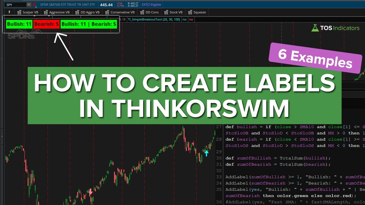
Labels are text displays that appear on your chart showing real-time information. You can use AddLabel() in thinkScript to create labels showing things like trend direction, squeeze status, support/resistance levels, or any calculated value. Labels update in real-time as the market moves.
An indicator typically shows one piece of information on a chart (like an oscillator or moving average). A dashboard aggregates multiple data points into a single view, often across symbols or timeframes. Think of dashboards as a cockpit view that shows you everything at once.
Yes, ThinkOrSwim allows full color customization. You can use conditional colors to highlight different states (like green for bullish, red for bearish), set background colors for emphasis, and match your overall chart theme. Our tutorials show you how to add professional color schemes.
Get Pro ThinkOrSwim Dashboards
Unlock advanced dashboards and course-exclusive tools with the Squeeze Course.