Table of Contents
- TTM Squeeze Dashboard Video Tutorial
- Stock Volatility Box Invite
- Designing the TTM Squeeze Dashboard
- How to Set Up a ThinkOrSwim Dashboard
- Stacked Moving Averages – thinkScript Code
- TTM Squeeze Dashboard – thinkScript Code
- Finding the Top 10 Holdings in each ETF
- Analyzing ETF Top Holdings With TTM Squeeze Dashboard
Welcome to the 13th episode of “How to thinkScript”.
In this video, we’re going to build a TTM Squeeze Dashboard for ThinkOrSwim, similar to what you often see people easily doing with TradeStation.
Here’s what our final dashboard will look like:

TTM Squeeze Dashboard Video Tutorial
The custom code written for the TTM Squeeze dashboard is available for free download below.
Stock Volatility Box Invite
We are TOS Indicators.com, home of the Volatility Box. We started sending out invites for our new Stock Volatility Box Tool, which makes it dead easy to day trade stocks.
In the tutorial video, we show you an example of a trade in PHM.
PHM fell perfectly into our Volatility Box, and bounced from
there. Our first target was 0.83% and the stock is currently up more than 2.2%
from our entry point.
That’s the power of being able to use Volatility Models and Price Movement Ranges that you can trust.
Click here to sign up for our Stock Volatility Box Tool.
Designing the TTM Squeeze Dashboard
Before starting to build our TTM Squeeze Dashboard, we want to make sure we have a clear idea of how we’d like it to look. The final product, really.
Let’s make a quick mock using PowerPoint.
We’ll give this table 6 columns. You can customize them however
you’d like, but for our tutorial, we’ll do this.
First column will be the symbol. Next, let’s say we want only
the strongest candidates on this dashboard. So we want stacked moving averages.
Next we want to know where there are multiple squeezes. And we’ll design this with bigger time frames for swing trading, but if you want to day trade, make the time frames smaller.

So the columns we care about are:
- Symbol
- Stacked Moving Averages
- Daily Squeeze (large time frame)
- 1 Hour Squeeze (medium time frame)
- 30 Minute Squeeze (short time frame)
If you want to include other indicators, change the time
frame, that’s all up to you, and easy to do.
How to Set Up a ThinkOrSwim Dashboard
Let’s get started.
For our TTM Squeeze Dashboard, we don’t really need to set up any PowerPoint slides here, so let’s just dive straight in.
We will open up our ThinkOrSwim platform, and rather than clicking the charts tab like we normally would, we will instead click the “MarketWatch” tab.
This is where we will be building the actual dashboard. However, we need to first start by creating a list of symbols. That needs to happen in our watchlist column.
Here, let’s start by creating a list of symbols. And the way we want to do this is like a funnel.
We want our largest ETF’s at the widest of this funnel. And we can keep narrowing down, based on top holdings, etc.
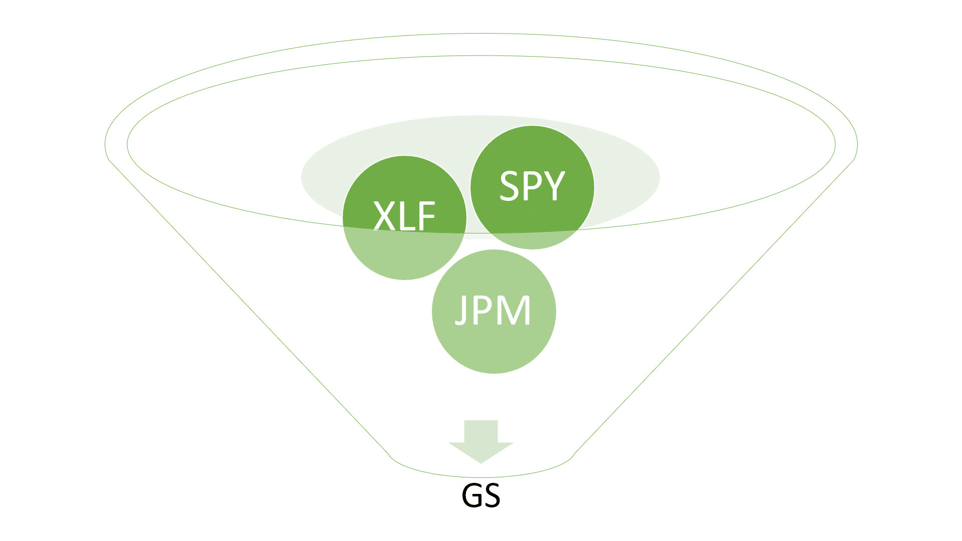
Here are the broad range ETF’s that we care about, which is
similar to our Futures Volatility Box markets:
- SPY
- QQQ
- IWM
- DIA
- GLD
- TLT
You get the idea. You can add as many, or as few symbols, as
you would like in this first funnel for the dashboard.
Now let’s click either the top of the table, or the gear
icon on the right hand side, and select “Customize” – this will be where we build
our studies for each of these columns.
Quick side note – ThinkOrSwim limits the amount of total “quotes”
as they call it, that you can have at any given moment. Your watchlist columns
count as quotes, your custom studies in MarketWatch count as quotes, and even custom
options chain quotes.
The more symbols you have, the more calculations ThinkOrSwim
has to do, which are counted against your quotes allocation.
Back to our code…
Stacked Moving Averages – thinkScript Code
The first column that
we’ll tackle is the stacked moving averages. Here, we want to see if the 8 is
above the 13 which is above the 21 which is above the 34. And vice versa. So
this is incredibly narrow. But, it helps to keep us focused.
Now, let’s write the thinkScript code to define the
exponential moving averages.
We’ll rename this to “Moving Averages” and make sure it’s set to a daily time frame. But you can change the time frame here if you would like.
def EMA8 = ExpAverage(close,8);
def EMA13 = ExpAverage(close,13);
def EMA21 = ExpAverage(close,21);
def EMA34 = ExpAverage(close,34);
Now, we need to add a label.
Let’s do that:
def bullish = EMA8 > EMA13 and EMA13 > EMA21 and EMA21 > EMA34;
def bearish = EMA8 < EMA13 and EMA13 < EMA21 and EMA21 < EMA34;
AddLabel(bullish, “Stacked MAs”, color.black);
AddLabel(bearish, “Stacked MAs”, color.black);
AddLabel(!bullish and !bearish, " ", color.black);
AssignbackgroundColor(if EMA8 > EMA13 and EMA13 > EMA21 and EMA21 > EMA34 then color.green else if EMA8 < EMA13 and EMA13 < EMA21 and EMA21 < EMA34 then color.red else color.black);
Click OK and save the file.
TTM Squeeze Dashboard – thinkScript Code
Next, we want to define our columns for the squeeze. Now let’s
introduce this idea of a 10-period lens.
Across the board, in each of our time frames, we would like to see what has been the sum of the red squeeze dots, across the past 10 bars.
- For the daily squeeze TTM_Squeeze, that means how many red dots over the past 10 days, using a daily squeeze
- For the 1hr squeeze TTM_Squeeze, that means how many red dots over the past 10 hours, using a hourly squeeze
- And for the 30 minute TTM_Squeeze, that means how many red squeeze dots over the past 5 hours, using a 30 minute squeeze.
Here’s some more thinkScript code to help us:
def squeeze = if TTM_Squeeze().SqueezeAlert == 0 then 1 else 0;
def sumSqueeze= Sum(squeeze, 10);
def squeezeFired = if TTM_Squeeze().SqueezeAlert[1] == 0 and TTM_Squeeze().SqueezeAlert == 1 then 1 else 0;
Now, let’s go ahead and create similar labels here.
AddLabel(squeezeFired, “Sqz FIRED “, color.white);
AddLabel(squeeze, “Sqz Count: “+sumSqueeze, color.white);
AssignBackgroundColor(if squeezeFired then color.green else if squeeze then color.red else color.black);
In the above TTM squeeze dashboard code, we use the default parameters for the squeeze.
If you would like to tweak the settings, you can use our free TTM Squeeze Backtester to help you determine the best settings for your specific chart.
Let’s recap what we’ve been able to do so far:
- Determine if we have stacked moving averages,
either bullish or bearish - Determine if we have a daily squeeze, and if so,
how many squeeze dots over the previous 10 bars
Now let’s copy paste this code 2 more times, for our
remaining two time frames, and make sure we set the aggregation period accordingly.
We’ll copy paste the entire code once more:
def squeeze = if TTM_Squeeze().SqueezeAlert == 0 then 1 else 0;
def sumSqueeze= Sum(squeeze, 10);
def squeezeFired = if TTM_Squeeze().SqueezeAlert[1] == 0 and TTM_Squeeze().SqueezeAlert == 1 then 1 else 0;

AddLabel(squeezeFired, “Sqz FIRED “, color.white);
AddLabel(squeeze, “Sqz Count: “+sumSqueeze, color.white);
AssignBackgroundColor(if squeezeFired then color.green else if squeeze then color.red else color.black);
And that gives us our full dashboard.
Finding the Top 10 Holdings in each ETF
Let’s complete the funnel now with a list of top holdings.
We’ll use ETFDb, a resource that will let us quickly find the
Top ETF Holdings. You can change the ETF in the URL to easily navigate across top
holdings:
[su_note text_color=”#161111″]URL: https://etfdb.com/etf/XLU/#holdings[/su_note]
Below is a list of 6 ETFs that we will break down in this
dashboard, along with the Top Holdings from each respective ETF.
The list is separated by comma’s, so you can easily copy and
paste the symbols into ThinkOrSwim.
Updated as of 1/29/20:
- ETF’s: XLF, XLY, XLV, XLP, XLE, XLU
- XLF: BRK.B, JPM, BAC, WFC, C, AXP, GS,
USB, CME, TFC - XLY: AMZN, HD, MCD, NKE, SBUX, LOW, BKNG,
TJX, TGT, GM - XLV: JNJ, UNH, MRK, PFE, MDT, ABT, BMY,
AMGN, TMO, ABBV - XLP: PG, KO, PEP, WMT, COST, MDLZ, MO,
PM, CL, KMB - XLE: XOM, CVX, EOG, COP, KMI, SLB, PSX,
OXY, VLO, MPC - XLU: NEE, SO, DUK, D, AEP, EXC, SRE, XEL,
ED, WEC
[su_note note_color=”#6ec34b” text_color=”#ffffff”]Pro Tip: For our Stock Volatility Box members, you can save the list above to run the weekly Stock Volatility Box for Top ETF Holdings.[/su_note]
Using the list above, let’s bring this video home, by going down the entire funnel.
Analyzing ETF Top Holdings With TTM Squeeze Dashboard
Let’s start actually using this dashboard now. We’ll take a broad approach by starting with our list of ETFs.
Here is a snapshot of the TTM Squeeze Dashboard:
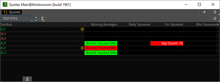
XLP is the only ETF with a current squeeze on either the daily, 1-hour or 30-minute time frame.
Let’s dig deeper… here is the dashboard for the Top 10 Holdings inside of XLP:

The only top holding with a squeeze is Walmart (WMT). Unfortunately, the moving averages signal a bearish move, versus the bullish moving averages for the broader ETF.
We can trim down the time frame to find more squeezes. Let’s change the aggregation period from daily, 1 hour, and 30 minutes to 15 minutes, 5 minutes and 3 minutes.
Here are the new results:

That’s more like it. Two results. Procter & Gamble (PG) and Coca Cola (KO).
Voila! It’s that simple to go from a broad ETF to exact opportunities, saving you time and letting ThinkOrSwim do the heavy lifting.
Download
Click the button below to download the code to build your own TTM Squeeze Dashboard.
Welcome to the 13th episode of “How to thinkScript”.
In this video, we’re going to build a TTM Squeeze Dashboard for ThinkOrSwim, similar to what you often see people easily doing with TradeStation.
Here’s what our final dashboard will look like:
TTM Squeeze Dashboard Video Tutorial
The custom code written for the TTM Squeeze dashboard is available for free download below.
Stock Volatility Box Invite
We are TOS Indicators.com, home of the Volatility Box. We started sending out invites for our new Stock Volatility Box Tool, which makes it dead easy to day trade stocks.
In the tutorial video, we show you an example of a trade in PHM.
PHM fell perfectly into our Volatility Box, and bounced from
there. Our first target was 0.83% and the stock is currently up more than 2.2%
from our entry point.
That’s the power of being able to use Volatility Models and Price Movement Ranges that you can trust.
Click here to sign up for our Stock Volatility Box Tool.
Designing the TTM Squeeze Dashboard
Before starting to build our TTM Squeeze Dashboard, we want to make sure we have a clear idea of how we’d like it to look. The final product, really.
Let’s make a quick mock using PowerPoint.
We’ll give this table 6 columns. You can customize them however
you’d like, but for our tutorial, we’ll do this.
First column will be the symbol. Next, let’s say we want only
the strongest candidates on this dashboard. So we want stacked moving averages.
Next we want to know where there are multiple squeezes. And we’ll design this with bigger time frames for swing trading, but if you want to day trade, make the time frames smaller.
So the columns we care about are:
- Symbol
- Stacked Moving Averages
- Daily Squeeze (large time frame)
- 1 Hour Squeeze (medium time frame)
- 30 Minute Squeeze (short time frame)
If you want to include other indicators, change the time
frame, that’s all up to you, and easy to do.
How to Set Up a ThinkOrSwim Dashboard
Let’s get started.
For our TTM Squeeze Dashboard, we don’t really need to set up any PowerPoint slides here, so let’s just dive straight in.
We will open up our ThinkOrSwim platform, and rather than clicking the charts tab like we normally would, we will instead click the “MarketWatch” tab.
This is where we will be building the actual dashboard. However, we need to first start by creating a list of symbols. That needs to happen in our watchlist column.
Here, let’s start by creating a list of symbols. And the way we want to do this is like a funnel.
We want our largest ETF’s at the widest of this funnel. And we can keep narrowing down, based on top holdings, etc.
Here are the broad range ETF’s that we care about, which is
similar to our Futures Volatility Box markets:
- SPY
- QQQ
- IWM
- DIA
- GLD
- TLT
You get the idea. You can add as many, or as few symbols, as
you would like in this first funnel for the dashboard.
Now let’s click either the top of the table, or the gear
icon on the right hand side, and select “Customize” – this will be where we build
our studies for each of these columns.
Quick side note – ThinkOrSwim limits the amount of total “quotes”
as they call it, that you can have at any given moment. Your watchlist columns
count as quotes, your custom studies in MarketWatch count as quotes, and even custom
options chain quotes.
The more symbols you have, the more calculations ThinkOrSwim
has to do, which are counted against your quotes allocation.
Back to our code…
Stacked Moving Averages – thinkScript Code
The first column that
we’ll tackle is the stacked moving averages. Here, we want to see if the 8 is
above the 13 which is above the 21 which is above the 34. And vice versa. So
this is incredibly narrow. But, it helps to keep us focused.
Now, let’s write the thinkScript code to define the
exponential moving averages.
We’ll rename this to “Moving Averages” and make sure it’s set to a daily time frame. But you can change the time frame here if you would like.
def EMA8 = ExpAverage(close,8);
def EMA13 = ExpAverage(close,13);
def EMA21 = ExpAverage(close,21);
def EMA34 = ExpAverage(close,34);
Now, we need to add a label.
Let’s do that:
def bullish = EMA8 > EMA13 and EMA13 > EMA21 and EMA21 > EMA34;
def bearish = EMA8 < EMA13 and EMA13 < EMA21 and EMA21 < EMA34;
AddLabel(bullish, “Stacked MAs”, color.black);
AddLabel(bearish, “Stacked MAs”, color.black);
AddLabel(!bullish and !bearish, " ", color.black);
AssignbackgroundColor(if EMA8 > EMA13 and EMA13 > EMA21 and EMA21 > EMA34 then color.green else if EMA8 < EMA13 and EMA13 < EMA21 and EMA21 < EMA34 then color.red else color.black);
Click OK and save the file.
TTM Squeeze Dashboard – thinkScript Code
Next, we want to define our columns for the squeeze. Now let’s
introduce this idea of a 10-period lens.
Across the board, in each of our time frames, we would like to see what has been the sum of the red squeeze dots, across the past 10 bars.
- For the daily squeeze TTM_Squeeze, that means how many red dots over the past 10 days, using a daily squeeze
- For the 1hr squeeze TTM_Squeeze, that means how many red dots over the past 10 hours, using a hourly squeeze
- And for the 30 minute TTM_Squeeze, that means how many red squeeze dots over the past 5 hours, using a 30 minute squeeze.
Here’s some more thinkScript code to help us:
def squeeze = if TTM_Squeeze().SqueezeAlert == 0 then 1 else 0;
def sumSqueeze= Sum(squeeze, 10);
def squeezeFired = if TTM_Squeeze().SqueezeAlert[1] == 0 and TTM_Squeeze().SqueezeAlert == 1 then 1 else 0;
Now, let’s go ahead and create similar labels here.
AddLabel(squeezeFired, “Sqz FIRED “, color.white);
AddLabel(squeeze, “Sqz Count: “+sumSqueeze, color.white);
AssignBackgroundColor(if squeezeFired then color.green else if squeeze then color.red else color.black);
In the above TTM squeeze dashboard code, we use the default parameters for the squeeze.
If you would like to tweak the settings, you can use our free TTM Squeeze Backtester to help you determine the best settings for your specific chart.
Let’s recap what we’ve been able to do so far:
- Determine if we have stacked moving averages,
either bullish or bearish - Determine if we have a daily squeeze, and if so,
how many squeeze dots over the previous 10 bars
Now let’s copy paste this code 2 more times, for our
remaining two time frames, and make sure we set the aggregation period accordingly.
We’ll copy paste the entire code once more:
def squeeze = if TTM_Squeeze().SqueezeAlert == 0 then 1 else 0;
def sumSqueeze= Sum(squeeze, 10);
def squeezeFired = if TTM_Squeeze().SqueezeAlert[1] == 0 and TTM_Squeeze().SqueezeAlert == 1 then 1 else 0;

AddLabel(squeezeFired, “Sqz FIRED “, color.white);
AddLabel(squeeze, “Sqz Count: “+sumSqueeze, color.white);
AssignBackgroundColor(if squeezeFired then color.green else if squeeze then color.red else color.black);
And that gives us our full dashboard.
Finding the Top 10 Holdings in each ETF
Let’s complete the funnel now with a list of top holdings.
We’ll use ETFDb, a resource that will let us quickly find the
Top ETF Holdings. You can change the ETF in the URL to easily navigate across top
holdings:
[su_note text_color=”#161111″]URL: https://etfdb.com/etf/XLU/#holdings[/su_note]
Below is a list of 6 ETFs that we will break down in this
dashboard, along with the Top Holdings from each respective ETF.
The list is separated by comma’s, so you can easily copy and
paste the symbols into ThinkOrSwim.
Updated as of 1/29/20:
- ETF’s: XLF, XLY, XLV, XLP, XLE, XLU
- XLF: BRK.B, JPM, BAC, WFC, C, AXP, GS,
USB, CME, TFC - XLY: AMZN, HD, MCD, NKE, SBUX, LOW, BKNG,
TJX, TGT, GM - XLV: JNJ, UNH, MRK, PFE, MDT, ABT, BMY,
AMGN, TMO, ABBV - XLP: PG, KO, PEP, WMT, COST, MDLZ, MO,
PM, CL, KMB - XLE: XOM, CVX, EOG, COP, KMI, SLB, PSX,
OXY, VLO, MPC - XLU: NEE, SO, DUK, D, AEP, EXC, SRE, XEL,
ED, WEC
[su_note note_color=”#6ec34b” text_color=”#ffffff”]Pro Tip: For our Stock Volatility Box members, you can save the list above to run the weekly Stock Volatility Box for Top ETF Holdings.[/su_note]
Using the list above, let’s bring this video home, by going down the entire funnel.
Analyzing ETF Top Holdings With TTM Squeeze Dashboard
Let’s start actually using this dashboard now. We’ll take a broad approach by starting with our list of ETFs.
Here is a snapshot of the TTM Squeeze Dashboard:
XLP is the only ETF with a current squeeze on either the daily, 1-hour or 30-minute time frame.
Let’s dig deeper… here is the dashboard for the Top 10 Holdings inside of XLP:
The only top holding with a squeeze is Walmart (WMT). Unfortunately, the moving averages signal a bearish move, versus the bullish moving averages for the broader ETF.
We can trim down the time frame to find more squeezes. Let’s change the aggregation period from daily, 1 hour, and 30 minutes to 15 minutes, 5 minutes and 3 minutes.
Here are the new results:
That’s more like it. Two results. Procter & Gamble (PG) and Coca Cola (KO).
Voila! It’s that simple to go from a broad ETF to exact opportunities, saving you time and letting ThinkOrSwim do the heavy lifting.
TTM Squeeze Dashboard.ts
# TTM Squeeze Dashboard for ThinkOrSwim

# Generated by TOS Indicators

# Full tutorial: tosindicators.com/indicators/ttm-squeeze-dashboard

# User Inputs

input length = 14;


// ... 23 more lines ...Adding TTM Squeeze Dashboard to your ThinkOrSwim platform is a straightforward process that takes just a few minutes. First, open your ThinkOrSwim desktop application and navigate to any chart. Click the "Studies" button in the top toolbar, then select "Edit Studies" from the dropdown menu. In the Studies window that appears, you'll see a search box in the upper left corner. Type "TTM Squeeze Dashboard" to quickly locate the indicator. Once found, double-click it or select it and click "Add Selected" to apply it to your chart. The indicator will appear with default settings, which work well for most traders. However, you can customize these by clicking the gear icon next to the indicator name in the studies list. This opens the settings panel where you can adjust periods, colors, and other parameters. For best results, start with a liquid stock like SPY or QQQ on a 15-minute chart to see how the indicator behaves. Many professional traders recommend saving your configured chart as a template using the "Setup" menu, so you can quickly apply the same indicator settings to other symbols. Remember to test the indicator during different market conditions - trending, ranging, and volatile periods - to understand its strengths and limitations before using it for live trading decisions.
The optimal settings for TTM Squeeze Dashboard depend significantly on your trading style, timeframe, and the specific instruments you trade. For day trading, most professionals recommend using shorter timeframes like 5-minute or 15-minute charts with more sensitive settings to capture intraday movements. Start with the default parameters and adjust based on your backtesting results. For example, on SPY or QQQ, you might use a period of 9-14 for quick signals, while more volatile stocks like TSLA might require periods of 20-30 to filter out noise. Swing traders typically prefer daily charts with standard settings, often using periods between 20-50 for more reliable signals. The key is to find settings that generate signals aligning with your risk tolerance and trading plan. Test different configurations using ThinkOrSwim's OnDemand feature, which allows you to replay historical market data. Document your results with different settings across various market conditions - bullish trends, bearish trends, and sideways markets. Many successful traders use a two-chart approach: one with aggressive settings for early signals and another with conservative settings for confirmation. Remember that no single setting works perfectly in all market conditions, so consider having preset configurations for trending versus ranging markets that you can switch between based on current conditions.
TTM Squeeze Dashboard compatibility with ThinkOrSwim mobile varies depending on the indicator's complexity and whether it's a built-in or custom study. To check availability, open your ThinkOrSwim mobile app and navigate to the Charts section by tapping the chart icon at the bottom. Select any symbol, then tap the indicators button (usually shown as "fx" or a graph icon). Search for "TTM Squeeze Dashboard" in the studies list. If it appears, you can add it just like on desktop. However, mobile versions often have limitations - complex calculations may be simplified, some visual elements might not display, and customization options are typically reduced. For full functionality, most traders use a hybrid approach: perform detailed analysis on desktop where you have access to all features and customization options, then monitor positions and key levels on mobile. Set up push notifications for important price levels or indicator signals to stay informed while away from your desktop. If TTM Squeeze Dashboard isn't available on mobile, consider setting up alerts on the desktop version that will push to your phone. Many traders also use ThinkOrSwim's cloud sync feature to ensure their watchlists and basic chart settings transfer between devices. For critical trading decisions, always verify signals on the desktop platform where you have access to complete functionality and can view multiple timeframes simultaneously.
Setting up alerts with TTM Squeeze Dashboard in ThinkOrSwim enables you to monitor multiple opportunities without watching screens constantly. To create an alert, right-click on your chart where TTM Squeeze Dashboard is displayed and select "Create Alert" from the context menu. In the alert dialog, you can set conditions based on the indicator's values, crossovers, or when it reaches specific levels. For example, you might set an alert when TTM Squeeze Dashboard crosses above a certain threshold or when it generates a buy/sell signal. Choose your notification method - ThinkOrSwim can send alerts via pop-up, email, or mobile push notification. For mobile alerts, ensure you're logged into the ThinkOrSwim mobile app with notifications enabled. Many traders create multiple alert types: aggressive alerts for early signals and conservative alerts for confirmed setups. You can also create complex alerts using thinkScript that combine TTM Squeeze Dashboard with other conditions like price levels or volume thresholds. Set alert expiration appropriately - use "GTC" (Good Till Canceled) for ongoing monitoring or specific dates for time-sensitive setups. To manage alerts efficiently, use descriptive names indicating the symbol, timeframe, and condition (e.g., "SPY_15min_TTM Squeeze Dashboard_Bullish"). Test your alerts during market hours to ensure they trigger correctly. Pro tip: Create a separate alert set for pre-market and after-hours if you trade extended sessions, as indicator behavior may differ with lower volume.
TTM Squeeze Dashboard can be highly effective for swing trading when configured appropriately for longer holding periods. Swing traders typically use daily and weekly charts, focusing on capturing moves lasting several days to weeks. For TTM Squeeze Dashboard, adjust the settings to be less sensitive than day trading configurations - this means using longer periods (typically 20-50) to filter out intraday noise and focus on meaningful trend changes. When analyzing stocks like AAPL or MSFT for swing trades, combine TTM Squeeze Dashboard with volume analysis to confirm signal strength. Look for convergence between TTM Squeeze Dashboard signals and key support/resistance levels identified on weekly charts. Many successful swing traders use a top-down approach: identify the trend on weekly charts, then use daily charts with TTM Squeeze Dashboard to time entries. Set your stops based on the Average True Range (ATR) to accommodate normal price fluctuations without getting stopped out prematurely. For position sizing, consider the indicator's historical accuracy - if backtesting shows 60% win rate, size positions accordingly. The key advantage of using TTM Squeeze Dashboard for swing trading is the ability to stay in winning trades longer by following the indicator's trend signals rather than reacting to every minor pullback. Pro tip: Create a watchlist of stocks showing TTM Squeeze Dashboard signals on weekly charts, then monitor daily charts for optimal entry points when short-term pullbacks occur within the larger trend.
Selecting the optimal timeframe for TTM Squeeze Dashboard depends on your trading objectives and market approach. Day traders typically find 5-minute and 15-minute charts most effective, as these provide enough data points for the indicator to generate reliable signals while still capturing intraday movements. For stocks like SPY or QQQ, the 5-minute chart works well during high-volume periods (first and last hour of trading), while 15-minute charts help filter noise during midday. Swing traders generally prefer daily charts as their primary timeframe, using 4-hour charts for precise entry timing and weekly charts for overall trend context. The key is ensuring your timeframe aligns with your intended holding period - use a chart where 50-100 bars represent your typical trade duration. Scalpers might even use 1-minute charts with TTM Squeeze Dashboard, though this requires careful filtering to avoid overtrading. Many profitable traders use multiple timeframe analysis: confirm the trend on a higher timeframe, then use lower timeframes with TTM Squeeze Dashboard for entry signals. For example, if the daily chart shows bullish signals, look for pullback entries on hourly charts. Volume also influences timeframe selection - thinly traded stocks often require longer timeframes (hourly or daily) for reliable signals, while high-volume stocks like AAPL or TSLA can produce valid signals on shorter timeframes. Test different timeframes during various market sessions to find your optimal configuration.
Backtesting TTM Squeeze Dashboard strategies in ThinkOrSwim requires a systematic approach to generate reliable results. Start by using the Strategy function rather than just the Study - this allows ThinkOrSwim to track hypothetical trades and calculate performance metrics. Navigate to Studies > Edit Studies > Strategies, then search for or create a strategy based on TTM Squeeze Dashboard. If creating custom logic, use the thinkScript editor to define entry and exit conditions based on the indicator's signals. For accurate results, test across different market conditions using at least 2-3 years of historical data. Include realistic parameters like commission costs ($0.65 per contract for options, for example) and slippage (0.05-0.10 for liquid stocks like SPY). Use the OnDemand feature to forward-test your strategy in replay mode, which helps identify issues not apparent in standard backtesting. Document results across different timeframes and market conditions - what works in trending markets may fail in choppy conditions. Pay attention to key metrics: win rate, average win/loss, maximum drawdown, and profit factor. A good strategy typically shows profit factor above 1.5 and maximum drawdown under 20%. Test on multiple symbols to ensure the strategy isn't curve-fitted to one particular stock. Many traders find it helpful to backtest the inverse signals as well - if buy signals underperform, perhaps the indicator better identifies shorting opportunities.
TTM Squeeze Dashboard is well-suited for beginners when approached with proper education and practice. Start by understanding the basic concept behind the indicator - what it measures and why those measurements matter for trading decisions. Before using real money, spend at least 2-4 weeks practicing with ThinkOrSwim's paper trading feature. Add TTM Squeeze Dashboard to charts of major indices like SPY or QQQ, as these tend to have cleaner price action that's easier for beginners to interpret. Focus initially on the most obvious signals rather than trying to catch every move. Use default settings at first - they're designed to work reasonably well across different market conditions. As you gain experience, you can fine-tune parameters. Combine TTM Squeeze Dashboard with basic price action concepts like support and resistance to increase accuracy. Set up a trading journal to track when the indicator works well and when it doesn't - this helps identify optimal market conditions for using it. Many beginners make the mistake of relying solely on one indicator; instead, use TTM Squeeze Dashboard as part of a broader analysis including volume, trend, and market structure. Start with small position sizes, risking no more than 1% of your account per trade while learning. Consider joining ThinkOrSwim's education resources or finding a mentor who uses similar indicators to accelerate your learning curve.
Here are some resources that you may find useful: