
One Simple Tool to Optimize Trade Selection
Comparing Salesforce and Honeywell short setups using the multi-timeframe Market Pulse. Honeywell in distribution with bearish labels was the better trend-following short. Salesforce in acceleration was only a mean-reversion candidate.

Comparing Two Short-Side Setups
In the companion video, both Salesforce and Honeywell appeared on the stock Volatility Box live scanner as short-side candidates on the same day. The question: which trade is better? The multi-timeframe (MTF) Market Pulse provides the answer by showing you the trend state across multiple timeframes at a glance.
Honeywell: The Trend-Following Short
Starting with the daily timeframe, Honeywell's Market Pulse label showed a market stage of distribution. This tells you the stock is in bearish territory. Loading the MTF Market Pulse labels on the chart revealed red and orange labels across nearly every timeframe, from the 30-minute through the weekly. All signals pointed to bearish trend momentum.
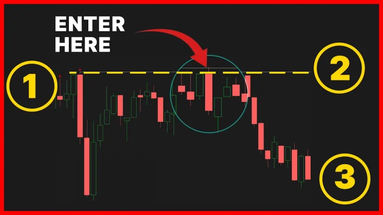
On the 30-minute chart, Honeywell had been in a red (bearish) Market Pulse trend for multiple days leading up to the session. The day's price action rallied into the Volatility Box aggressive models and briefly went into acceleration before pulling back. This was a classic trend pullback setup: a strong bearish trend on the higher timeframes, a temporary pullback into resistance (the VB models), and then a resumption of the downtrend.
Salesforce: The Mean-Reversion Trade
Salesforce told a different story. The daily Market Pulse label showed acceleration, meaning the stock was in a strong bullish trend. The MTF labels were mostly green and yellow across the 30-minute, hourly, and weekly timeframes.
The only short setup available on Salesforce was a mean-reversion trade: waiting for the bullish trend to exhaust. On the 30-minute chart, there were signs of exhaustion through Keltner Channel wedges, edge signal confirmations, and momentum crosses. But this required fading a strong trend, which is inherently lower probability than trading with the trend.
The Decision Framework
For trend followers: look for setups where the MTF Market Pulse shows bearish labels (red/orange) on the 30-minute, hourly, daily, and weekly timeframes. Find pullbacks into resistance (like Volatility Box models) within that bearish trend, and enter short on the pullback.
For mean-reversion traders: look for setups where the MTF labels show strong trends that are beginning to exhaust. Drop to smaller timeframes (5-minute or 2-minute) to find precise entries on momentum crosses.
When both setups appear on the scanner at the same time, the trend-following setup in the weaker market tends to be the more effective trade. In this example, Honeywell's trend pullback produced better follow-through than Salesforce's exhaustion trade.
How to Load the MTF Market Pulse
For all Volatility Box members, the MTF Market Pulse is included free with your membership. Load it onto your chart when comparing trade candidates. The labels show the Market Pulse state for each timeframe (5-minute through weekly) in a single row. Red and orange labels indicate bearish trends. Green and yellow indicate bullish. Focus on the 30-minute, hourly, daily, and weekly labels for the highest-quality trend information.
Tip: load the indicator only when you need to compare setups, then remove it to keep your charts fast.
Frequently Asked Questions
What is the MTF Market Pulse?
The multi-timeframe Market Pulse shows the trend state (acceleration, distribution, etc.) across multiple timeframes on a single chart. Red/orange labels indicate bearish trends. Green/yellow indicate bullish. It is included free for Volatility Box members.
Why was Honeywell the better short?
Honeywell had distribution on the daily, with red and orange labels across all longer timeframes. This meant you were shorting in the direction of the trend. The Volatility Box models provided a pullback entry within that bearish trend.
Can Salesforce still be shorted?
Yes, but only as a mean-reversion trade. Since the daily was in acceleration with green/yellow labels, you would be fading a strong trend. This requires waiting for clear exhaustion signals and using smaller timeframes for precise entries.
Which timeframes matter most on the MTF labels?
The 30-minute, 1-hour, daily, and weekly timeframes provide the highest-quality trend information. When these are aligned (all red/orange or all green/yellow), the trade direction is clear.
Should I always trade with the trend?
Trend-following setups tend to produce more follow-through. In this video, the trend-following short on Honeywell was more effective than the mean-reversion short on Salesforce. If both types of setups appear, the trend-following trade is generally the higher-probability choice.

Ready to Trade With an Edge?
Join 40,000+ traders using institutional-grade tools for ThinkOrSwim.
Get the Bundle