
 Fair Value Gap
 False Breakout Scanner
 Heiken Ashi Trend
 Stock Volatility Box
 Futures Volatility Box
 ORB Setups
 Squeeze Setups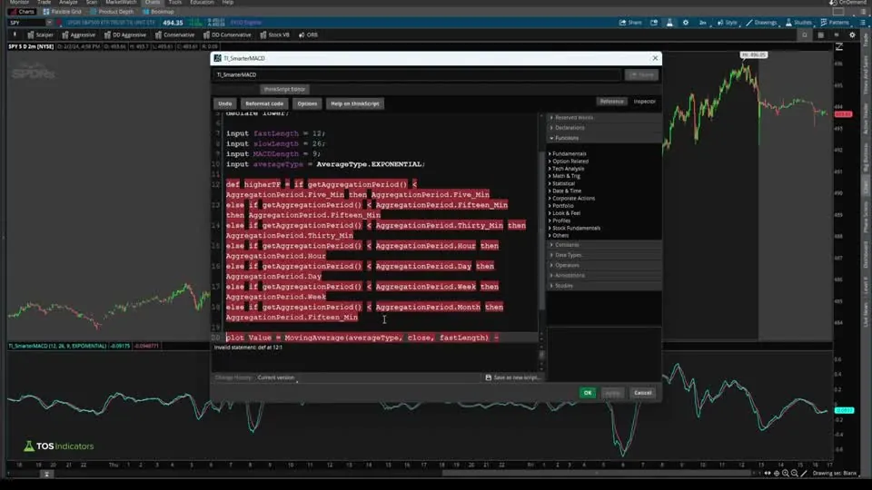
On this page
Overview
In this tutorial I build a smarter MACD indicator for ThinkOrSwim, starting from the built-in MACD code. The built-in MACD gives you a histogram, two lines and a zero line, which gets noisy and comes with a lot of settings. The Smarter MACD condenses all of that into one line that turns green or red, so you can read the trend at a glance and make decisions faster.
The indicator runs its MACD math on a higher time frame than your chart, picked automatically, and gives you two settings: lever, for how quickly it reacts to price, and mode, for how long it waits for confirmation before the color switches. It's a beginner-friendly build, a first step into multiple time frame indicators, and the next part of our MACD series.
Key Takeaways
- The Smarter MACD is a free ThinkOrSwim lower study that plots one MACD line at line weight 2: green after the line rises, red after it falls.
- It calculates the MACD from the next time frame up: 5-minute data on 1- to 4-minute charts, 15-minute data on 5- and 10-minute charts, weekly data on a daily chart and yearly data on a monthly chart.
- The lever input sets the moving averages. Fast, the default, uses 3 and 8 exponential, Medium the standard 12 and 26 exponential, and Slow 10 and 20 simple.
- The mode input sets the length of the average the line plots. Aggressive uses the lever's fast length and Conservative its slow length, in place of the built-in MACD's 9.
- ThinkOrSwim scans reject the higher time frame code, so the members-only scan version sets the scan's aggregation to that time frame instead: weekly to match a daily chart.
What Is the MACD Indicator?
The MACD (Moving Average Convergence Divergence) indicator measures the gap between two moving averages of price. Gerald Appel developed it in the late 1970s. The standard version subtracts the 26-period exponential moving average (EMA) of the close from the 12-period EMA to get the MACD line, then plots a 9-period EMA of that line as the signal line. The histogram is the MACD line minus the signal line.
ThinkOrSwim's built-in MACD study uses those 12, 26 and 9 lengths by default and plots all of it: the Value and Avg lines, a histogram and a zero line. That's a lot to read at once, and on a busy chart it gets noisy. Our MACD explained tutorial starts the series, and the Smarter MACD continues it.
What the Smarter MACD Plots
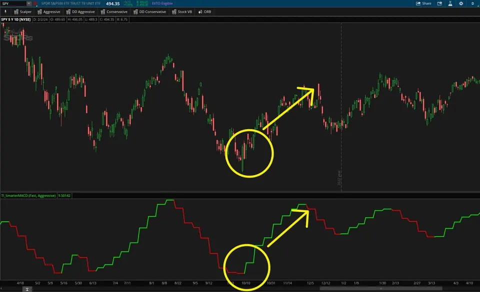
The Smarter MACD plots one line in a lower panel, and the color of that line is the trend. The line is the built-in MACD's Avg line, the smoothed MACD, calculated on a higher time frame with the lengths you choose.
| Color | When it shows | What it tells you |
|---|---|---|
| Green | The line rose the last time it moved | The higher time frame MACD is trending up |
| Red | The line fell the last time it moved | The higher time frame MACD is trending down |
| Gray | The line hasn't risen or fallen yet, at the start of the chart | No trend set yet |
How the Higher Time Frame Mapping Works
The Smarter MACD reads your chart's time frame with GetAggregationPeriod() and picks the next time frame up for its calculations. I call this mapping. If you've never built a multiple time frame indicator, it's a good introduction to the idea.
| Your chart | MACD calculated on |
|---|---|
| Under 5 minutes (1, 2, 3 or 4 minutes) | 5 minutes |
| 5 minutes, up to but not including 15 (5 and 10 minutes) | 15 minutes |
| 15 minutes, up to but not including 30 | 30 minutes |
| 30 minutes, up to but not including 1 hour | 1 hour |
| 1 hour, up to but not including 1 day (hourly and 4-hour charts) | 1 day |
| Daily, up to but not including 1 week | 1 week |
| Weekly, up to but not including 1 month | 1 month |
| Monthly | 1 year |
A 15-minute chart isn't below 15 minutes, so it moves down a row and uses 30-minute data. The same goes for every boundary: a chart that equals a time frame in the list reads the next one up.
I use the higher time frame to make the line on your chart a little more reliable and accurate. When I added it on a 2-minute chart in the video, the line shifted as soon as it switched to 5-minute data. Our aggregation periods tutorial covers plotting larger time frames on smaller charts in more depth.
Smarter MACD Lever and Mode Settings
The Smarter MACD has two inputs, and each answers one question. Lever answers how quickly you want to react to price. Mode answers how long you want to wait for confirmation before the color switches.
| Lever | Fast length | Slow length | Average type |
|---|---|---|---|
| Fast (default) | 3 | 8 | Exponential |
| Medium | 12 | 26 | Exponential |
| Slow | 10 | 20 | Simple |
Fast is my aggressive setting, and 3 and 8 is quickly becoming my favorite fast pair. I can be that quick because the higher time frame already adjusts for it. For Slow I used the 10 and 20 simple moving averages instead of something as slow as the 50 or 200, and Medium keeps the standard 12 and 26.
Mode sets the length of the average the line plots. Aggressive uses the lever's fast length, so Fast and Aggressive smooths over 3 bars. Conservative uses the slow length, so Fast and Conservative smooths over 8 bars and switches color later. Both replace the built-in MACD's default of 9.
The 3 levers and 2 modes give you 6 versions of the line. If 3 and 8 means something different to you, change the numbers or the average type in the code.
How to Build the Smarter MACD in ThinkOrSwim
The Smarter MACD build starts from ThinkOrSwim's own MACD code. These are the steps I follow in the video:
- Click the Studies icon and search for MACD. Click the scroll icon next to the built-in MACD to open its code, and copy all of it.
- Click Create, delete everything in the new study and paste the MACD code. I named mine TI_SmarterMACD.
- Delete everything below the Avg line. Our own logic replaces the histogram and the rest.
- Add the higher time frame variable and feed it into both close prices.
- Add the lever and mode inputs with their switch statements, and change the Value plot to a def so only one line plots.
- Add upSwitch and downSwitch, color the line and set its weight to 2.
To skip the build, download the finished study from this page and import it. Our 4-minute guide on how to import a study into ThinkOrSwim shows how.
How the Smarter MACD Code Works
The Smarter MACD code keeps the built-in MACD's math and changes what goes into it. Here are the blocks, in the order I wrote them.
Step 1: Pick the Higher Time Frame
GetAggregationPeriod() returns your chart's time frame, and aggregation period is ThinkOrSwim's term for time frame. Each line of higherTF checks whether the chart is below a time frame and, if it is, uses that time frame.
This step’s code is free with an account. Create one or sign in.
The final else catches monthly charts and sends them to yearly data.
Step 2: Feed It Into the MACD
This step’s code is free with an account. Create one or sign in.
Adding period = higherTF to both close prices makes the MACD read the higher time frame's closes. In the built-in study, Value is a plot. Here it's a def, so it calculates without drawing a second line.
Step 3: The Lever Switch
An input with a list in braces becomes a dropdown in the study's settings, and default marks the starting choice. The 3 defs start empty, and the switch fills them in for whichever lever you pick.
This step’s code is free with an account. Create one or sign in.
The Slow and Medium cases follow the same pattern with their own numbers, and the Value line picks them up.
Step 4: The Mode Switch and the Plot
This step’s code is free with an account. Create one or sign in.
outputLength takes the lever's fast or slow length, and the plot averages Value over that many bars. This is the built-in Avg line under a new name, smarterMACD, which the color logic references next.
Step 5: The Up and Down Switches
The two switches define the trend: the MACD line rising or falling compared with the previous bar. downSwitch mirrors upSwitch.
This step’s code is free with an account. Create one or sign in.
upSwitch is 1 when the line is higher than on the previous bar and resets to 0 when it's lower. A flat bar carries the last value forward, so the trend holds until the line turns.
Step 6: Color and Weight
This step’s code is free with an account. Create one or sign in.
AssignValueColor paints the line green where upSwitch is true, red where downSwitch is true and gray otherwise. A weight of 2 makes the line a little thicker than the default of 1.
What Each Setting Showed in the Video
The Smarter MACD settings move the color switch earlier or later on the same chart. At the end of the video I compared them on one drop and noted roughly when each combination switched trend afterwards:
| Lever and mode | Trend switch after the drop |
|---|---|
| Fast, Aggressive | Mid-March |
| Fast, Conservative | End of March |
| Medium, Aggressive | Between May and June |
| Slow, Aggressive | Sometime in June |
| Slow, Conservative | End of June |
The Fast lever with Aggressive mode switched first, and each step to a slower lever or to Conservative pushed the switch later. Choose the combination that fits your trading style, study the markets you trade with it, and then stick with it instead of fussing with lengths.
How I Use the Smarter MACD
The Smarter MACD is a trend read. Green says the higher time frame MACD is rising, red says it's falling, and the color change is where I look for reversals. The indicator works on any time frame, and I expect the daily chart is where most traders will use it. On a monthly chart it reads yearly data, which probably isn't that useful.
A color change alone isn't an entry. Check it against price and your levels, decide where your stop goes before you enter, and size the position so a stop-out costs a small, fixed share of your account.
To test MACD signals over history, our MACD signals backtester is the next stop in the series. For a scan built on the regular MACD, see the MACD crossover near zero line scan.
How to Customize the Smarter MACD
The Smarter MACD is built to be tweaked. To change what Fast means, edit the two lengths or the average type in the Fast case. Each case sets fastLength, slowLength and averageType, and everything below it reads those 3 values.
The higher time frame list works the same way. Each else if line maps one range of charts to one time frame, so editing a line changes which data that range of charts reads.
On a daily chart the line moves in steps: flat through the week, then a jump. Every daily bar in a week reads the same weekly close, so the line can only change when a new week starts. Intraday charts show the same effect on a smaller scale.
Smarter MACD Scans for Volatility Box Members
The Smarter MACD scans come from a members-only follow-up video for Volatility Box members. The indicator is tricky to turn into a scan, and the video shows the workaround.
Paste the indicator code into a custom scan filter and ThinkOrSwim shows the error "secondary period not allowed." The higher time frame variable asks for smaller time frames than the scan's daily aggregation can reach. The fix is to comment out the higher time frame lines, use a plain close, and set the filter's aggregation to the time frame the indicator would have used.
| To match the Smarter MACD on | Set the scan aggregation to |
|---|---|
| A daily chart | Week |
| A 15-minute chart | 30 minutes |
| Any other chart | The time frame the mapping table above gives that chart |
The scan then looks for the bar where the color flips. A green switch is a bar where upSwitch is true and wasn't true on the bar before, and a red switch is the same test on downSwitch. The scan plots one of the two, and the indicator's formatting lines go.
In the video, the green switch with a weekly aggregation returned about 46 symbols in the S&P 500, including Uber and Southern Company. The red switch turned up Microsoft. With a 30-minute aggregation and extended hours included, the red scan found Carnival (CCL), whose 15-minute Smarter MACD had turned red.
The Smarter MACD scans and the follow-up video are included with a Volatility Box membership. See Volatility Box membership pricing.
Smarter MACD on real charts
Drawn from real daily bars with the code on this page, through Oct 20, 2026. On a daily chart the study switches to weekly data, so these are weekly closes drawn on daily candles, with the defaults: the Fast lever (3 and 8-period EMAs) in Aggressive mode.
SPY since March
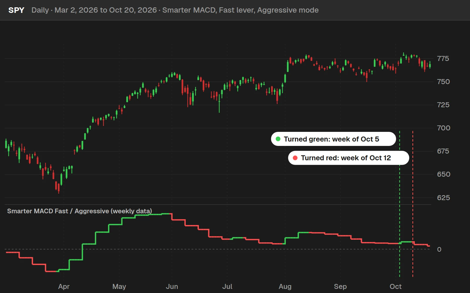
The line last turned red in the week of Oct 12, 2026: that week closed at $763.25, below the prior week's $778.57. Before that it turned green in the week of Oct 5, 2026. On past weeks each day shows that week's final value. During the current week the line uses the latest close, so its color can still change until Friday's close.
By the numbers
Weekly closes of SPY, QQQ, IWM, DIA and 10 sector ETFs, Jan 4, 2016 to Oct 20, 2026, counted at the close of the week the color changed (the earliest a trader knows it). A turn to green was followed by a higher close about as often as any week. The 1,029 turns to red were followed by a lower close 4 weeks later 43.0% of the time, against 38.7% for any week. These ten years were mostly a rising market. The line reads the trend; it is not a timing signal on its own.
Full thinkScript code
Create a free account or sign in to copy all 56 lines and download the file.
Download
Download the Smarter MACD indicator for ThinkOrSwim. The download is a .zip with one study file, TI_SmarterMACDSTUDY.ts, the same code as the Code tab on this page, plus a .txt with a link to our import video. The members-only scans are a separate download at the end of the article. If you haven't added a custom study before, here's how to import an indicator into your ThinkOrSwim platform.
Questions
What is the Smarter MACD indicator?
The Smarter MACD is a free ThinkOrSwim lower study built from the built-in MACD code. It plots one line, the smoothed MACD, calculated on the next time frame up from your chart. The line is green after it rises and red after it falls, so the trend reads at a glance. Two inputs, lever and mode, set its speed and how long it waits for confirmation.
What are the default MACD settings in ThinkOrSwim?
The built-in MACD uses a 12-period fast average, a 26-period slow average and a 9-period average of the MACD line, all exponential by default. In the Smarter MACD, the Medium lever keeps 12 and 26 exponential, and the mode setting replaces the 9 with the lever's fast or slow length.
How do I add the Smarter MACD to ThinkOrSwim?
Download the zip from this page and import TI_SmarterMACDSTUDY.ts as a study, or copy the code from the Code tab. To paste it, click the Studies icon, then Create, delete the starter code and paste. Save it and add it to a chart. The study declares itself lower, so it opens in its own panel.
What time frame does the Smarter MACD use on a daily chart?
On a daily chart, the Smarter MACD calculates the MACD from weekly closes. The code steps up one level from your chart: 1- to 4-minute charts use 5-minute data, 5- and 10-minute charts use 15-minute data, 15-minute charts use 30-minute data, weekly charts use monthly data and monthly charts use yearly data.
What is the difference between the lever and mode settings?
Lever sets how quickly the MACD reacts to price by choosing the averages: Fast is 3 and 8 exponential, Medium 12 and 26 exponential, Slow 10 and 20 simple. Mode sets how long you wait for confirmation by choosing the length of the plotted average: Aggressive uses the lever's fast length and Conservative its slow length.
What do the green and red colors on the Smarter MACD mean?
Green means the line rose the last time it moved, and red means it fell. A flat bar keeps the previous color, so the color holds until the line turns. Gray shows only before the line has moved either way. The switch from red to green, or green to red, is the trend change to watch.
Can I scan for Smarter MACD color changes?
Yes, with a workaround from a members-only video. Pasting the indicator into a scan gives a secondary period not allowed error, so the scan drops the higher time frame code and sets the filter's aggregation to that time frame instead, weekly to match a daily chart. Volatility Box members get the video and the bullish and bearish scans.
Why does the Smarter MACD use a higher time frame?
I use the higher time frame to make the line on your chart a little more reliable and accurate. A 2-minute chart reads the 5-minute MACD, and a daily chart reads the weekly MACD. Because the higher time frame adjusts for it, I could make the Fast lever as short as 3 and 8.
Related tools
 MACD Indicator, a complete breakdown
 MACD Signals Backtester, a complete breakdown
 MACD Crossover Near Zero Line
 Parabolic SAR
 Candle Counter
 Volume Intensity
Get each new indicator by email
One email on Sundays with the week's new tool and its code. A free account also unlocks every .txt download.
No credit card. Unsubscribe anytime.